Returning to GFW this year was a bizarre experience; it was fantastic being there and actually getting to wander round the other stands and appreciate everyones work properly - last year felt like a complete whirlwind and everyone was competing against each other for industry attention. It was so good to have a different perspective and walk round at a leisurely pace enjoying the work and talking to students about their wonderful collections.
Well, I'm not biased but for me, Northumbria's Fashion Design, Fashion Marketing & Fashion Communication stand totally stood out for me and win's my 'Best In Show.' All students' work was displayed so well and was easy to navigate; with some University's stands, I didn't really know where to start! Here are some of my favourites from Northumbria..
Charis Younger - Fashion Design
I've been following Charis for a while - she's a fellow North-Eastern lady, a fellow Northumbria graduate and this collection absolutely blew me away. Titled 'The Human Versus The Machine', Charis made amazing use of structure and contrasted this with more feminine, flowing shapes. The standout pieces for me were the grey waterfall coat (need this in my wardrobe!) and the strapless, flowing mid-length dress with unbelievably, exquisite printwork.
Follow Charis on Twitter - @Charisimo
Jennifer Broom - Fahion Design
Another fellow North-Easterner really hit the mark for me. Again, structure was contrasted with looser shapes and I absolutely loved the harnessing detail across the collection. The standout pieces for the me was the grey, flecked coat and the fabulous accessories. The somewhat reminded me of Rodarte's A/W 2011 collection - inspired by Prairie girls and with references to the Wizard of Oz.
Follow Jennifer on Twitter - @jai_bee
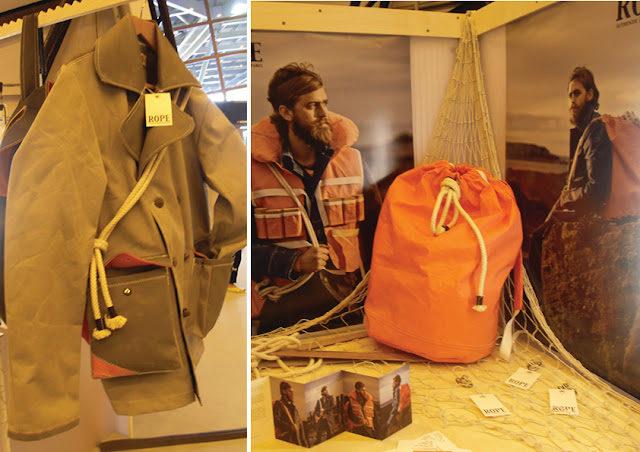
Other standout work from Graduate Fashion Week in pictures.
The menswear at GFW was a complete standout for me - lots of mens outerwear and alot of students' work was based around exploring the outdoors, so they created fantastic, durable pieces.
Other favourites were the accessories at the ECA stand and Nottingham Trent's stand design; fantastic visual merchandising.
Catwalk images © 2011 Christopher Moore Limited - catwalking.com
All other images © Alice Mary Barnes, 2011


Beautiful, wonderful work. Great photos of it as well.
ReplyDelete